
NAVIGATE HERE
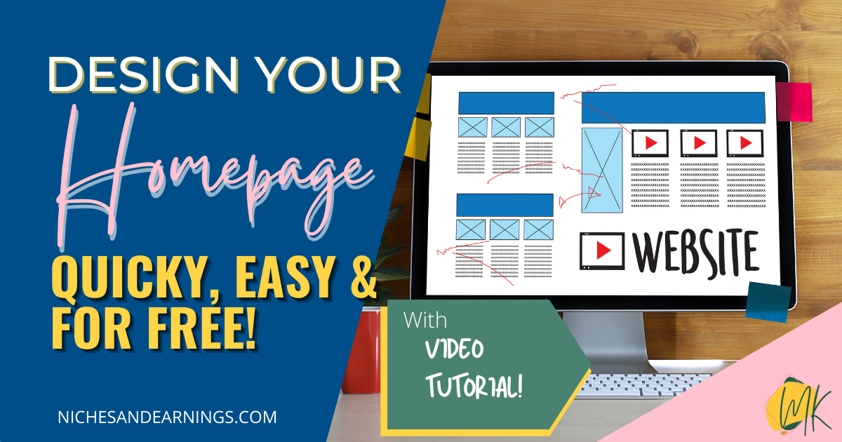
After reading this post, you will learn how you can design your site’s homepage quickly, easy and for free!
How to design homepage on a budget and easily when you’re a new blogger
Most of the time, when you start a blog you often wonder how to design your website but unfortunately not all of have the ability to do so nor have money to hire a web designer.
And designing a website is also considered as one of struggles of a new blogger.
That’s why in this post, you will learn how to create and design your homepage / home page quickly, easy and for free! The process is so simple and doable even for new bloggers!
So, did I get your attention? Okay. Let’s start!
What is homepage?
Well, we’re not going to design your entire website but, your homepage is a HUGE part of your website and here is why.
First let’s talk about, what homepage is. Home page or homepage is the main web page of a website. So, basically, this is the part of the website where you land, when you enter their URL to search engine.
Let me show you an example, when search for Pat Flyn’s website, smartpassiveincome on search engine, you’ll land on his home / homepage that look like this :

If you visited his site few years ago, then, you’ll agree with me when I say, it doesn’t look like this– It was black and if I remember correctly, and on the top header is where he shows his income.
But, now it’s different and full of information about his website.
The images above, only shows its first 2 sections of his homepage which are (1) Call to Action for his courses along with images of his students that function as “proof”. And also his logo and navigation menu.
On the (2) second image is another Call to Action where he includes video of himself talking about his SPI Course. And there are still 10 or more sections (I think) and they are :
- Articles / Blog Posts
- Podcasts
- Section that shows the established people he collaborates with like Gary Vee.
- His Courses
- His Private Group / Community
- Testimonials
- Workshops
- Free Guides
- Tools
- Another CTA – Email Subscription
- Footer
I’d like to show you another example, Start a Mom Blog by Suzi Whitford. She’s quite famous among mom bloggers including myself. Here’s the first 2 sections of her homepage :

The first section (right) is shows her logo, navigation menu, social media icons, search bar, and free course, which is her main Call to Action. And on the second section (left) is her social proof.
These 2 sections are followed by at least 7 more sections, that shows :
- Her Guides for Beginners
- Short Bio
- Testimonials
- Another Course
- Most Popular Posts
- Latest Posts
- Social Links
- Footer
As you can see from the 2 homepage examples, although Pat Flyn has a lot, both contains almost the same components.
Which, lead me to my next topic.
CHECK OUT MY RECENT POSTS :
- How to Write Your First Blog Post: Beginners’ Guide
- Best 7 Tips on How to Pick a Domain Name
- 200+ Blog Post Ideas for New Bloggers to Skyrocket Consistency
What should a website homepage include?
Like what I mentioned above, both website contains the same components which perfectly gives us a hint on What should be a website homepage include.
You know? What elements or components should be included on a website homepage.
From the 2 examples above we can tell that the basic elements or components a website homepage should have are :
- Logo
- Navigation Menu
- Headline
- Call To Action
- Search Bar
- Blog Posts / Articles
- Images
- Social Links and
- Footer
And depending on where you at in your blogging career, you can also add the following elements :
- Secondary Call To Action
- Showcase your Services (e.g Course)
- Benefits of Your Services
- Content Offer like Guides
- Social Proof and
- Testimonials
Since this post is intended for new bloggers, I will focus on the “Basic Elements of a Homepage” when I show you how to design your homepage quickly, easy and for free.
If you want to Start a Blog but can’t still figure out your niche, TRY this Ultimate List of Blog Niche Ideas I created FOR YOU!
Design Your Homepage Quickly, Easy And Free!
This process is made possible using the plugin called, Elementor and the second plugin that I’ll be using is Premium Add-Ons for Elementor.
What is Elementor?
Elementor is the leading website builder platform for professionals on WordPress.
It is a website builder, meaning you can build your website without having to worry about codes, scripts or whatever they call it. It’s drag and drop so, anyone can do it. Professionals or not.
As a matter of fact, when I learned about it when I was in the process of building my website, I fell in love with it. And another good thing with Elementor is that, you can get it for free as a plugin in WordPress.
This is how I’m going to show you how to design your homepage using Elementor. Ready?
Design Your Homepage Quickly, Easy And Free! Here’s How!
You can design your homepage using Elementor in 2 ways :
- You can use homepage templates available in Elementor or, if you’re like me,
- You can diy it.
I’m going to start right away. So, you can design your homepage in no time.
Since, I will be using the Free version of Elementor– the design will not be super fancy. However, it will be simple professional “looking” and just enough for a new blogger,
Just remember that, you can change your homepage as you grow in your blogging journey.
I promise you, this will be fun.
Basic Elements of a Homepage
Alright first and foremost, there will be 5 Sections in the homepage. Representing some basic elements of a homepage :
- Site Info
- Short Bio
- Primary Call to Action
- Blog Posts
- Secondary Call to Action
Just to let you know that I along with written guide on How to Design Your Homepage for Free, there are 2 videos included in this post. Please refer to Table of Contents for easy access.
Step #1 Install Elementor Plugin
** Before you even start, be sure that you already have things planned. Which is your branding. You should already figured out, your brand colors and font to make your designing easy and faster!**
First thing you need to do, is to install the plugin. To do this, go to your WordPress dashboard – scroll down to plugins and click “add new”.
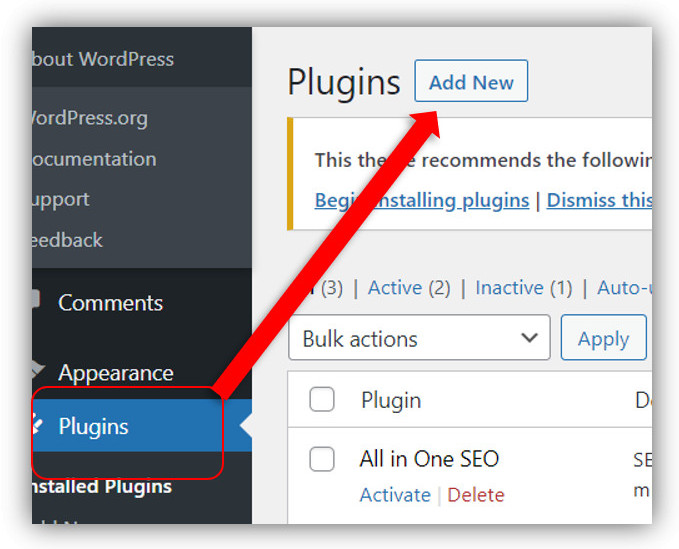
After clicking add new, it will bring you to WordPress plugin repository. From there, type “Elementor” on the search bar, then download “Elementor Website Builder” and “Essential Add-Ons for Elementor”.

Once you found it, click “Install Now”, then activate. Once you’re done, you may want to configure the settings for Essential Add-Ons for Elementor. It’s very easy, you’ll just turn on or off the elements you need.

You may want to review each of the elements, if you don’t know what element is it, you can click “demo” or “documentation” to get more info.
After you configure the settings, don’t forget to save the changes
Step #2 Create New Page
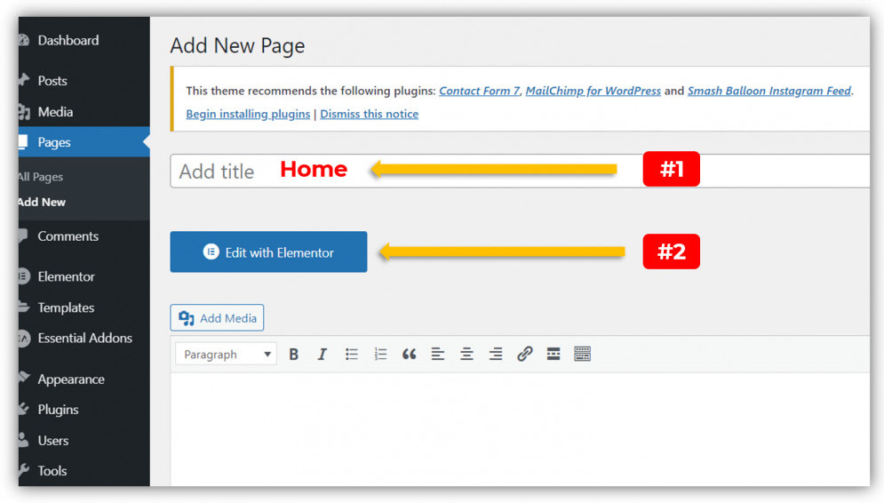
Again, in your dashboard, you need to go to Pages and click “Add New”. Same step when you added the plugins. Once it will open a new page, on the title bar, type Home as the title of the page. Then, click “Edit with Elementor”.
**Note: You have to make sure that you enter a title, otherwise once you click “Edit with Elementor”, elementor will give it a random title like “Elementor #14” or something. And it will appear on your page. Once you publish it.
After clicking “Edit with Elementor”, you will be brought to this page :
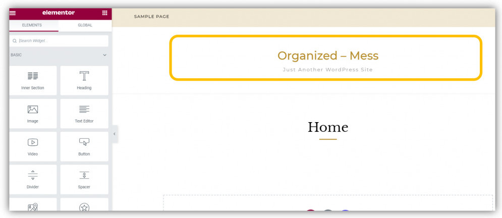
When you look at it, you’ll see my site title which is “Organized – Mess” and underneath is the default tagline that says “Just Another WordPress Site”. Of course, I’ll remove that or replace it with my own tagline.
HOW TO REMOVE OR EDIT TAGLINE :
- You need to go to your dashboard.
- Hover on Appearance, click customize.
- Once there, click site identity.
- Under tagline, there are options : “Hide Site Title?” and “Hide Tagline?”
- Tick “Hide Tagline”
- Hit Publish.
Next go to settings at the bottom right to adjust the Elementor page layout to “Elementor Full width”

Do this to remove the word “HOME” at the center of the page.
Step #3 Creating first section
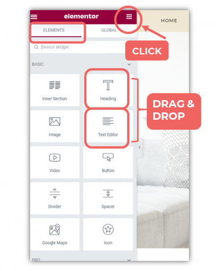
To do this, you need to create and edit your first section by clicking the + sign and selecting structure.

Next is, configure the settings of your structure by going to “Edit Section” on the right.

Next is you need to adjust the “Layout” and “Style” in this manner :
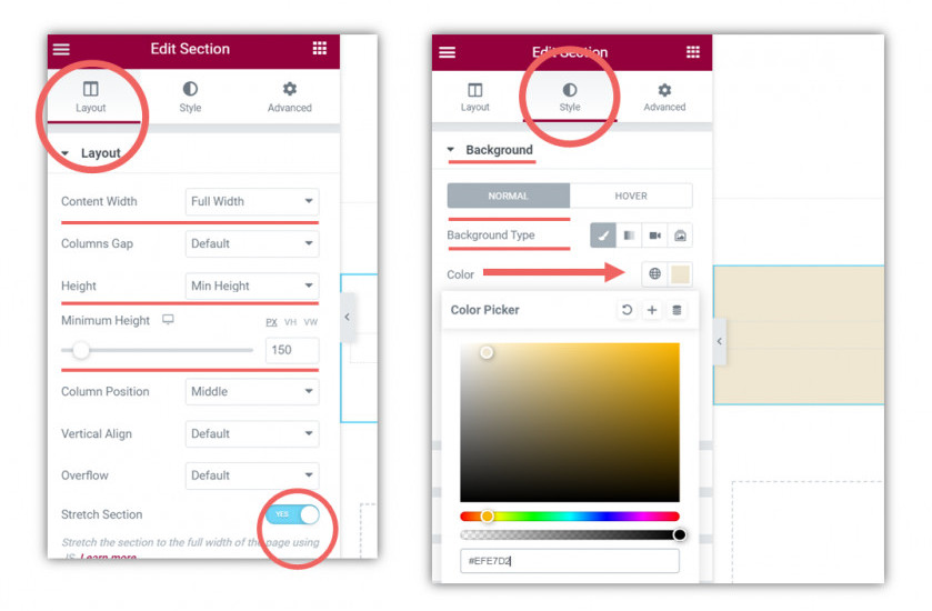
Please note that you can have a different color of your choice or nothing at all. This is just a guide.
After that your structure should look like this :

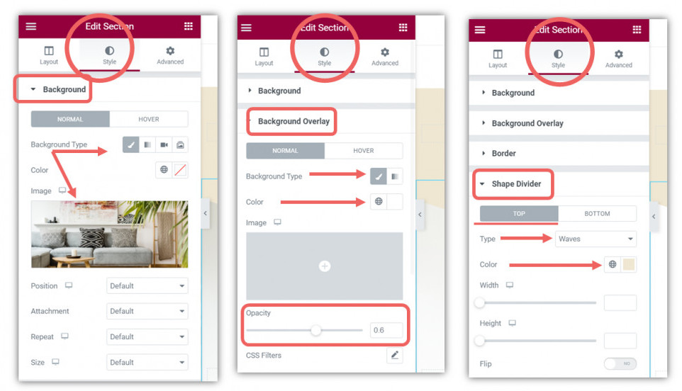
Because I want to design it even more, I’ll add another structure and have the same settings for the “Layout” except that the HEIGHT WILL BE FIT TO SCREEN instead of minimum height of 150.(check the image above). But I’ll have a different settings for “Style” :
The result will be like this :
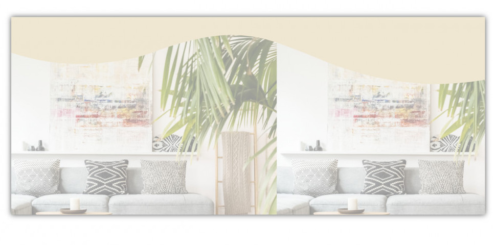
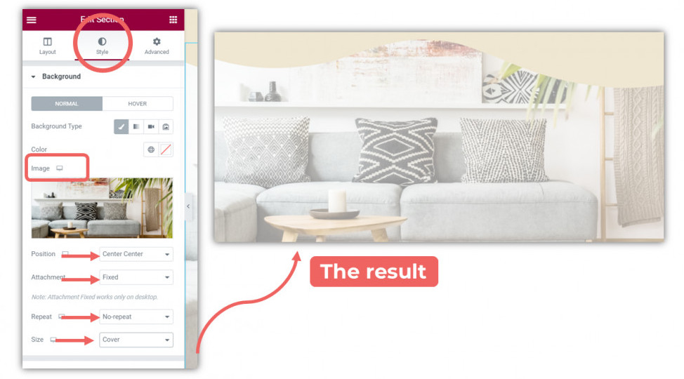
As you can see, the background has repeated image. This is how to solve it :
Step #4 Creating section 1 – The Site Info
Now that my first structure is edited and configured, it’s time to actually write my Site Info. To let my readers know, what my blog is all about and what they can get from it.
To do it. I’ll drag the Elements, 2 Headings and a Text Editor.
Then edit the fonts and colors to match my branding.
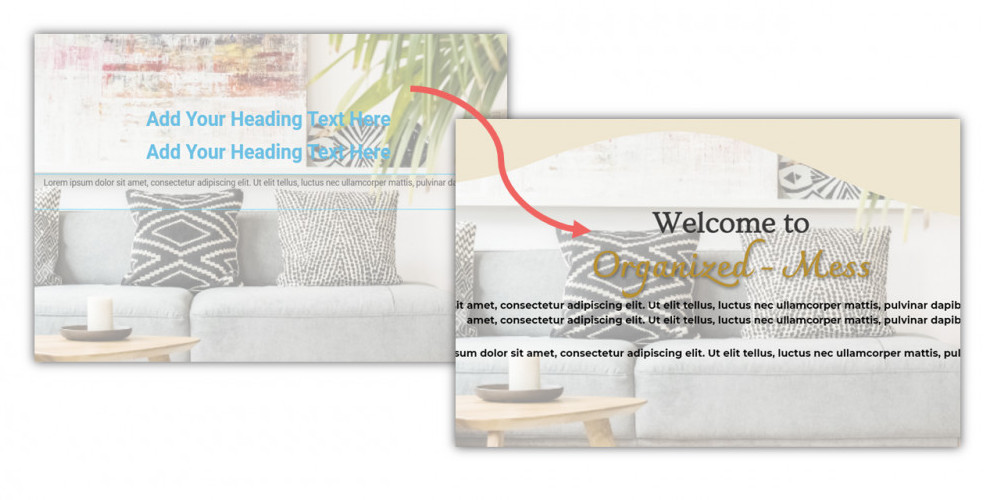
And this how you can do it :
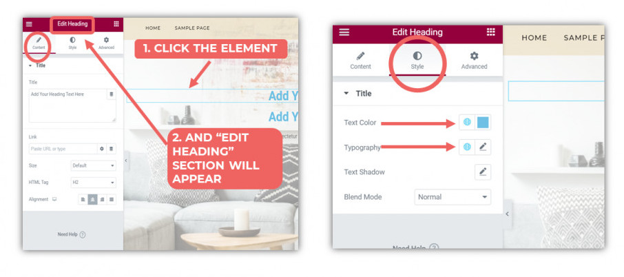
From the Content Tab, input your Text, Link if you have, HTML Tag and Alignment. In Style Tab, you can change the Text Color, Typography / Font, Text Shadow and Blend Mode. But in this tutorial, I just changed the color, font and put shadow to my Site Title.
Step #5 Creating section 2 – Short Bio
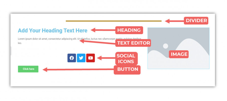
Okay, now for the second section of the homepage – The Short Bio. Where I tell my readers a little info about me and I’ll include a button that will lead them to my separate About Me page.
The Elementor Elements that I need are :
- Divider – I put to separate the first and second section
- Image
- Heading
- Text Editor
- Social Icons
- Button
For the “Divider” element, this is how to do it :
- Click the + sign
- Add a Single Column Structure – I will not touch the Layout part, it will remain as it is.
- From the Elements section, Drag & Drop Divider element
- Adjust and configure the setting how you want to be. For me, this is what I did :

And for Short Bio section, here’s how to do it :
- Click the + sign
- Select Structure – In this case, select 2 column structure. One column should be bigger than the other.
- Layout Setting will remain as is. I’m not going to touch anything.
- Drag and Drop the Elementor Elements I mentioned above.
Once the steps are finished, your section should look like this :
After that, all you need to do is to edit and configure the setting of each Elements.
For HEADING, TEXT EDITOR and DIVIDER– see the steps already mentioned above.
For IMAGE,
- Click the Image Element
- On the right-hand side the “Edit Image” section will appear
- Upload your image
- Adjust the size according to your preferrence

For Social Icons, here’s what to do :
- Click Social Icon element
- Edit and Configure the settings to change the appearance if you wish
- Input all your social links on the “Link” section
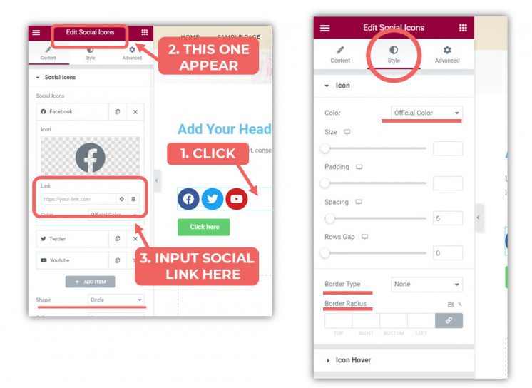
Please note, that on “Style Tab” I only touched Color, Border Type and Border Radius.
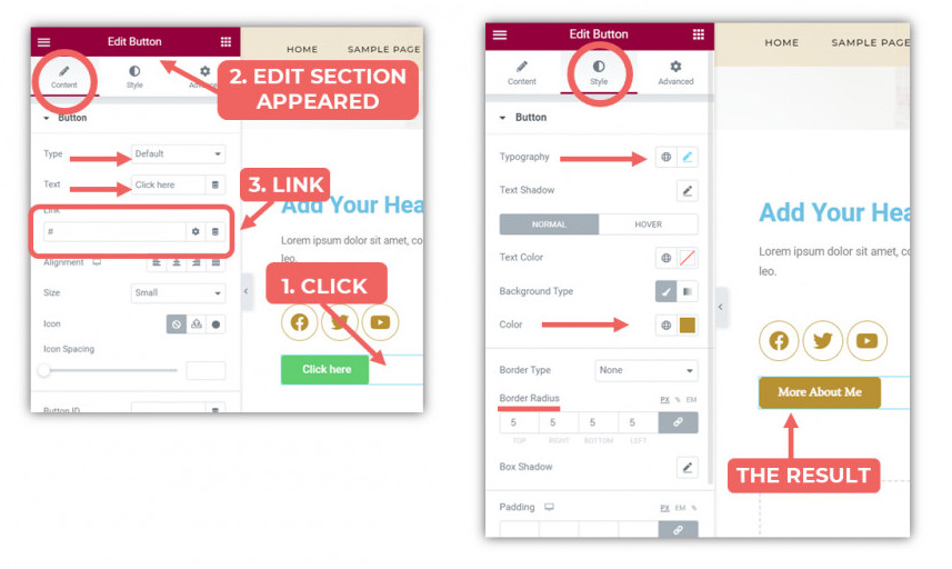
For the Button element, here’s what to do :
- Click Button element
- “Edit Button” section will appear on the right side
- Start editing. On Content Tab, is where you can put your text, choose what type of button, and input your link to separate About Me Page.
- Start editing. On Style Tab, is where you can literally style your button, change the color, font, border, hover animation etc.
- Final touch will be adding a DIVIDER ELEMENT at the end of it. You can just copy and paste the first divider you created a while ago.
Once done, my SHORT BIO looks like this :
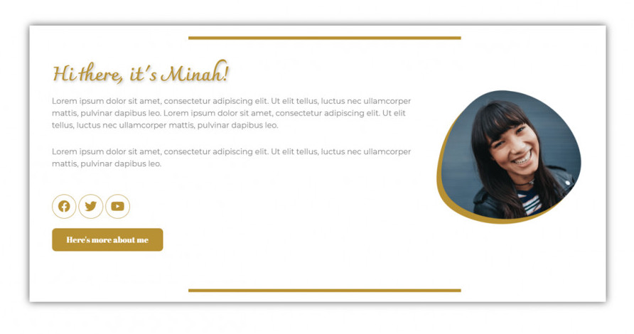
Pretty decent, eh? By the way, I already created the image using Canva. If you started your blog, Canva is a must – have! You can try it here >> Try Canva.
Now that 2 sections are done, we still have 3 more to go. To help you more understand the steps, I created a walk through video to make it easier to follow.
Walk – Through Video 1
Step #6 Creating section 3 – Primary Call To Action
For Primary Call to Action, or first CTA, I decided to have a “dummy/fake e book” as an offer to readers to I can get their email address for my email list.
But then, I thought, I created this tutorial for new bloggers, so, therefore you wouldn’t have an e book initially right?
So, you can actually change the e book to a simple freebie instead. Like for example, motivational quotes or calendar. You can create those easily using Canva.
Now, let’s go ahead and create the third section. Here’s how :
- As usual, click + sign
- Choose Structure – 2 Equal Sized Columns ; Will not touch Layout Setting
- Drag & Drop Elements – Right column, Image ; Left column, 2 Headings, Text Editor & a Button
Here’s what it looks like :

The only thing I touched here is the right margin under Advance Tab. And I chose the image to be in 300 x 300 size. Of course do not forget to copy and past the Divider at the bottom.
Since you already know how to edit Heading, Text Editor, Image and Button, I’ll show you the finish product. The steps are getting easier, don’t you think? Because, this is a rinse and repeat process.
This is how the Primary Call to Action section look like :

Step #7 Creating Section 4 – Blog Posts
In this section, I’m going to use one of the features available on Premium Add-ons for Elementor Plugin which is the Premium Blog Element.
First add structure, (click + sign, add single square structure), Layout remain as it is. Then drag & drop Heading Element. Edit it and write “Check out my posts”.
After adding a structure, add another one, here’s what to do next :
- Click on tiny squares
- Scroll down till you find “Premium Blog” element
- Drag & Drop it to the stucture

As you can see, there’s an image after drag & dropping the Premium Blog element. That image is actually the feature image of the dummy blog posts I created for the purpose of this tutorial.
How to Edit Premium Blog elements on Elementor :
- Click the Premium Blog section
- On the right side, Edit Premium Blog section will appear
- You’ll see different settings that you can experiment with until you get your desired “look”
- For me, I just edited the General Part, and under that, I just edit the Skin and Number of columns as shown below
- And don’t forget to copy and paste the existing divider element at the end


Once done, section 4 should look like this :

We are getting closer to the end. Yay!
Step #8 Creating section 5 – Secondary Call To Action
For Secondary Call To Action, I decided to go for simple invitation to my newsletter. Again, this is made up, I have no email autoresponder on this site.
You can change this part as well if you have no email autoresponder yet. You can drive your readers to your most compelling blog posts or a connection to your social media. Or can just simply end your homepage with blog post and add something later.
The Elements that we need are :
- Heading
- Text Editor
- Button
Since this is the end part, this should be the same design as the first section. So, the structure should be in Full Width and height should be Fit To Screen.
Here’s what to do :
- Add structure
- Drag & Drop Elements : Heading, Text Editor & Button
- Edit Elements
- For Text Editor, you’ll notice that the texts are way too wide so go to Advance Tab and adjust margin and padding.

How to add and edit Shape Divider Element in Elementor :
Like what I did from the very beginning of the tutorial, I added a Shape Divider on top. This time the shape divider element will be at the bottom.
Here’s how to do it :
- Hover on the Structure
- Click the six dots on top
- On right-hand side, “Edit Section” will appear
- On Style Tab, go to Shape Divider
- Click “Bottom”
- On type section, choose Waves
- Then Edit Color and make other adjustments according to your preference.

To finish the overall look, I still need to ADD ANOTHER STRUCTURE in full width with minimum height of 150 and with a background color same as the waves shape divider.
And here’s the final look :

Step #9 – Checking if your Homepage is Mobile Responsive
Nowadays, all of us check everything online in our hands, with the use of our mobile devices. So, it would only make sense to make sure that your blog is responsive to mobile devices. Otherwise, no one will visit your blog on their mobile hence, it will affect your site performance.
How to Check your Homepage Mobile Responsiveness
- While you are on Edit Mode, on right-hand side, at the bottom click the small mobile and desktop icon. And you’ll notice that the screen on the left will shrink.
- Click each section of your homepage
- Make necessary adjustment on the right. E.g. you can adjust the text size, margin / padding, etc
- You can also make adjustments for other devices like Tablet.
- Once your done, click PUBLISH.

I hope that everything is clear particularly the steps I provided. However, just to make sure, I supported this tutorial with a video as well. The first video that I showed above is actually part 1 and the video below is part 2.
You can also watch these videos on YouTube, and while you’re there, consider subscribing!
Walk – Through Video 2
Wrapping Up
Whew! This is a really long post! I wanted it to be thorough as much as possible and I’d like you to CREATE AND DESIGN YOUR HOMEPAGE QUICKLY, EASY AND FREE as I promised.
So, to wrap it up, Homepage is one of the most important pages of a website and it is one of the most visited among your pages as well. This is where you can tell your audience what help you can offer them, and what they can get from reading your blogs.
And here are the Basic Elements that a Website Homepage Should Have
- Logo
- Navigation Menu
- Site Info
- Short Bio
- Image
- Call To Action
- Blog Posts
Before I forgot
Well, you might be asking Why I showed you the 2 Great Sites from Pat Flyn and Suzi Whitford as an example. I didn’t use it to make you feel little about yourself.
I showed you so, when you (and I) reach that position, you (we) already have an idea how to design your (our) homepage!! Just, see it as an inspiration!
Oki doki, if you’re still here, thank you so much!
Let me know in the comments below, how’d you create your homepage, and what was your inspiration?
Itsy-bitsy request : If you find this post helpful, please do share!
Sharing this post will mean lot and will give me a sort of “energy” to create more helpful post like this.
Please click the sharing buttons here :
Thanks! I’ll see you in my next post!


Hi there! This is Minah, the blogger behind of Niches and Earnings | Start A Blog.
I created this website to be a place where you can get information on how you can start your blog. Also tips on blogging, how to use social media for your blog and make money in the cofort of your home.
Let’s connect on social media too!
Hi Minah,
Thanks for showing us the elements for a home page and the tool to build it. I believe people will find what they are looking for since you made it so comprehensive in this post.
I also love that you give out a free ebook as a way to get leads, and you can follow up to turn them into sales & commissions. Good job done here. 🙂
Cheers,
Matt
Hi Matt,
Thanks for dropping by, and glad you find this post helpful.
I try to be comprhensive on every post I create.
I want my blog to be the go-to for beginner bloggers =).
Yes, it’s true. And ebook is a great way to capture email subs.
Glad you appreciate it.
Minah
Minah,
I love this! I’ve actually gone back and forth on my blog and have created a landing page (homepage) and then deleted it. Honestly, I keep going back and forth on it. I do like the elementor and it’s overall look, so maybe I’ll tinker with that today and see how I like it.
Most of the big blogs out there have a home page, but then I’ve seen some that don’t. I’m not sure which does better for their audience, or which gets more views. But, I could see where, if you explain the purpose of your site, maybe more people would be prone to sticking around.
Thanks for covering this, it was very detailed.
Katrina
Hi Katrina,
Thanks for dropping by.
Well, when I created my blog, I actaully spent a lot of time
thinking should or should I not have an homepage/landing page.
I ended up doing so, because most of the bloggers I follow have one
and for me, it looks more professional.
So, I didn’t really think about my audience but I think of it as me being the audience.
Because, you know, even if we are the ones who write, on the other end of the line, we are also
audience ourselves.
But, now, I don’t regret having a homepage. Because, I found out that, it’s my most visited page so I took
advantage of it and place there my freebies, helpful posts that will make my visitor to jump to
another page of my blog.
As a result, I’m able to retain them.
And also, another thing to consider of having an homepage is your blog’s purpose or your purpose as blogger.
If you’re going to build your own personal brand, then, you should have a homepage.
So, you’ll have own place to showcase your sevices.
Hope it answers your question.
Anyway, thanks again for dropping by.
Minah
This is a very thorough tutorial on designing a homepage, and I’m sure beginners will find it very useful. I like all the features you get with Elementor, and it looks easy to use. I’m actually using GeneratePress which I believe is similar. I’ve yet to design my homepage, but having followed your tutorial I feel very inspired:)